Through the Looking-Glass

Celebrating Original Beauty
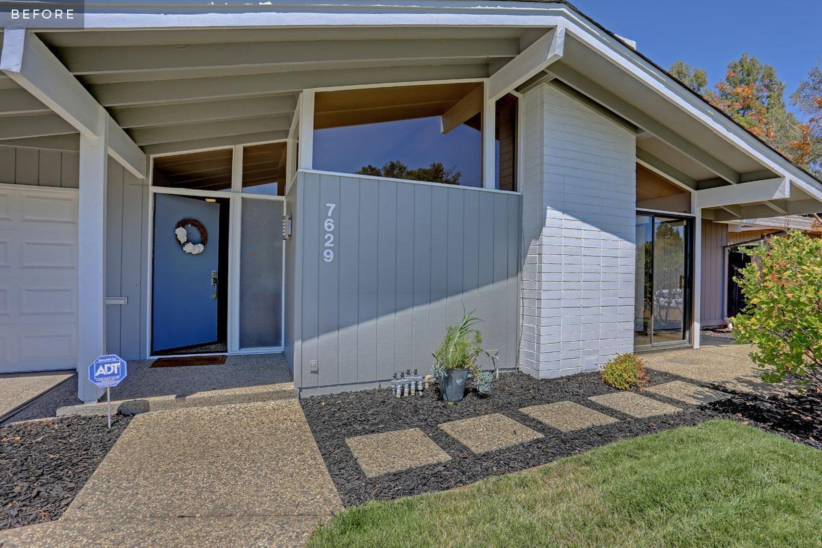
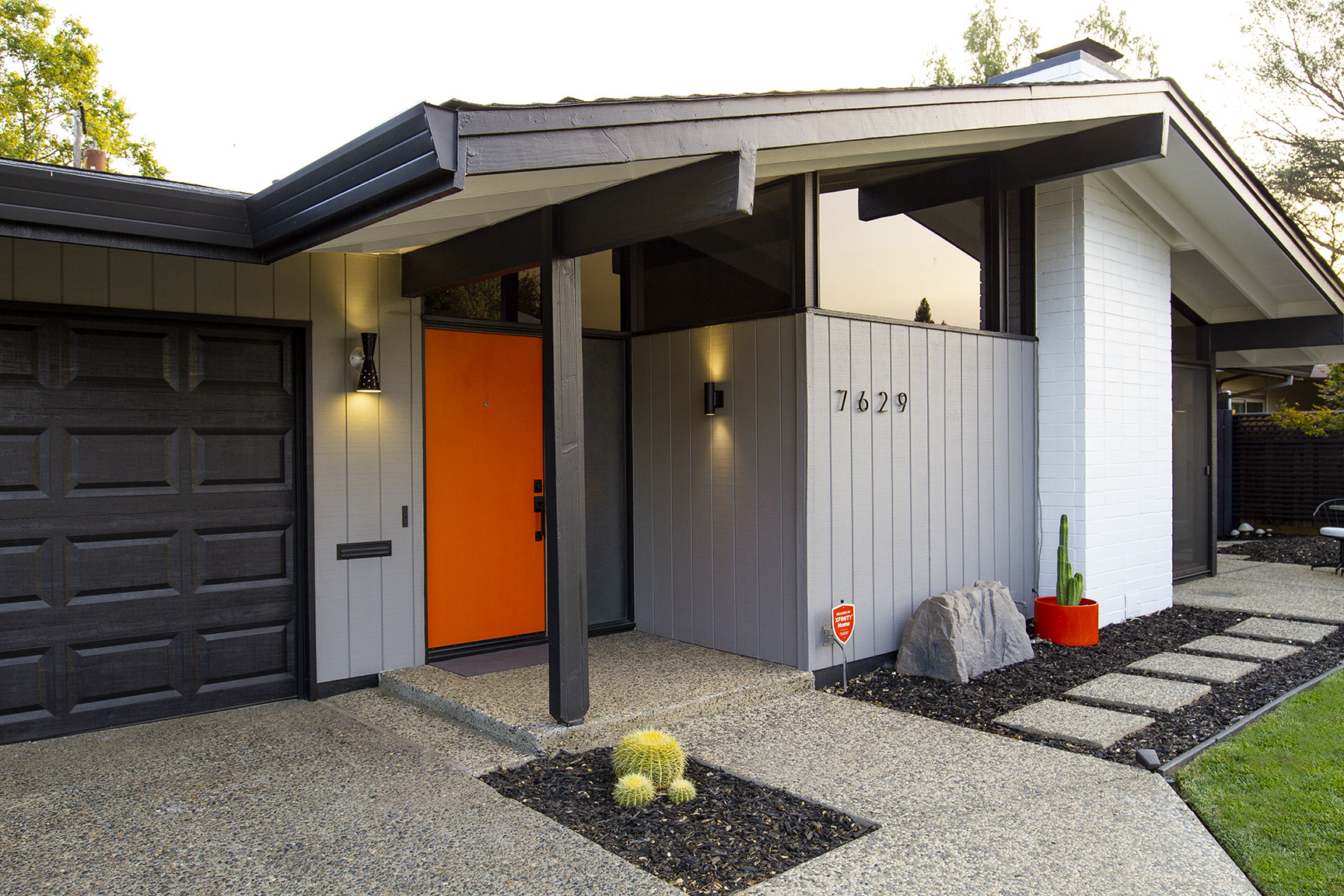
One of the most celebrated themes in mid-century architecture is indoor/outdoor living. Carter Sparks and the Streng Brothers were no strangers to this concept with the use of floor-to-ceiling windows, partial walls, post and beam construction, and aggregate concrete flooring in many of their designs.
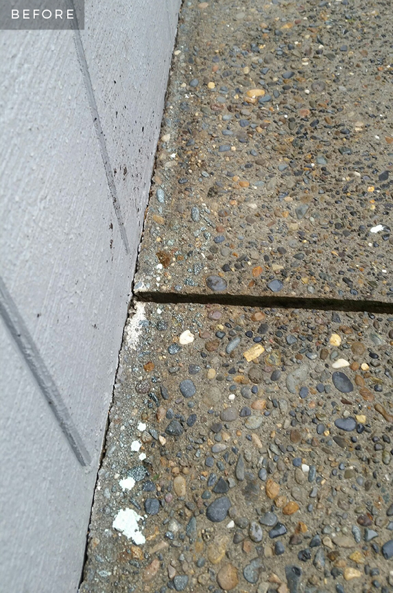
I often admire the use of aggregate in and around my home as these raw surfaces do a great job of keeping the space feeling open and airy from one room to the next. The aggregate can be seen in many spaces, including the driveway, front porch, foyer, front patio, back patio, and wrap-around sidewalks — making for over 800 square feet of outdoor living space!
Before winter rolled in, I had all of the aggregate pressure washed and sealed to remove years of weathering, neglect and generous paint spatters. Underneath all of those layers were warm, rich, natural colors that now look just as stunning as the day the concrete was poured.
Bringing the Outside In
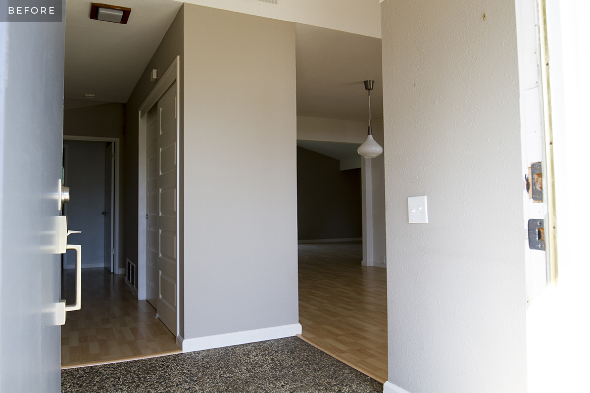
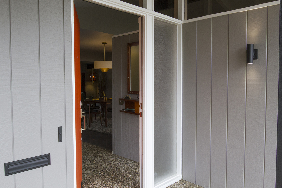
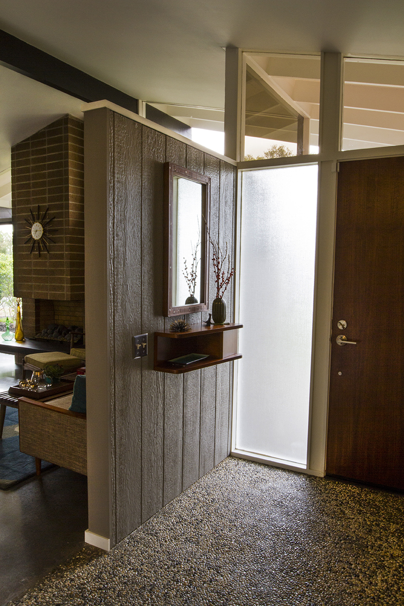
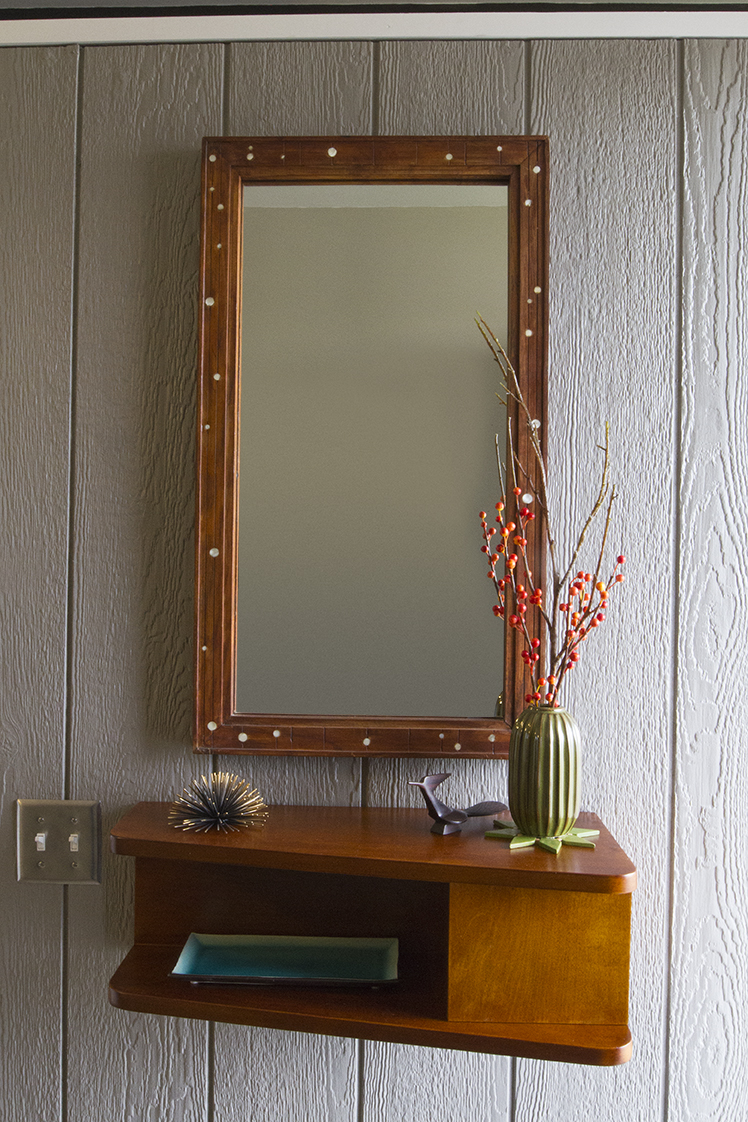
The beautiful stone continues from the front porch, straight into the foyer along with intersecting planes of glass and plywood. Once inside, the wall originally transitioned to textured plaster drywall. Covering this interior wall instead with siding to match the exterior seemed like a more natural transition that would further the principles of indoor/outdoor living.
Just a Few Materials
Finding siding to match the exterior was a cinch. After all these years, 8-inch T-11 plywood siding is still available at most hardware stores. Seeing as how the majority of my house is covered in this material, I couldn't be more thrilled!
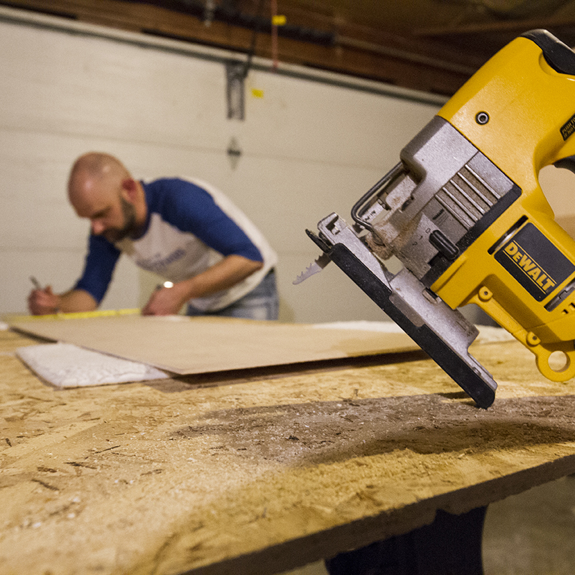
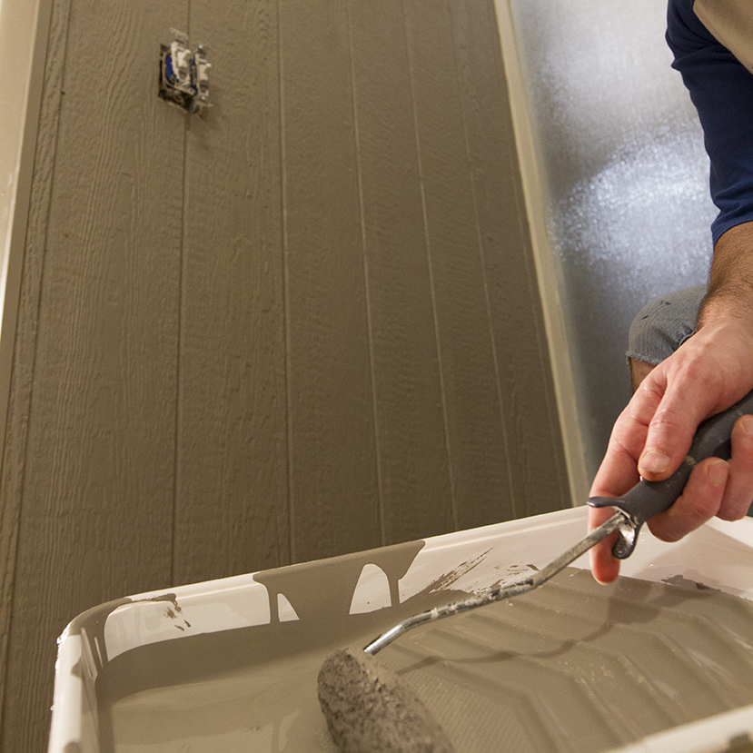
The foyer has a partial wall that terminates at the base of the clerestory windows, so I only needed 2 sheets of siding for this project. With some careful measuring, pencil markings and a jigsaw, I cut the sheet to fit the wall and carved an opening for the 2 gang light switch. I then attached the plywood to the wall studs with drywall screws and backfilled the screws with wood putty. Corners and edges were tacked down with finishing nails to prevent warping.
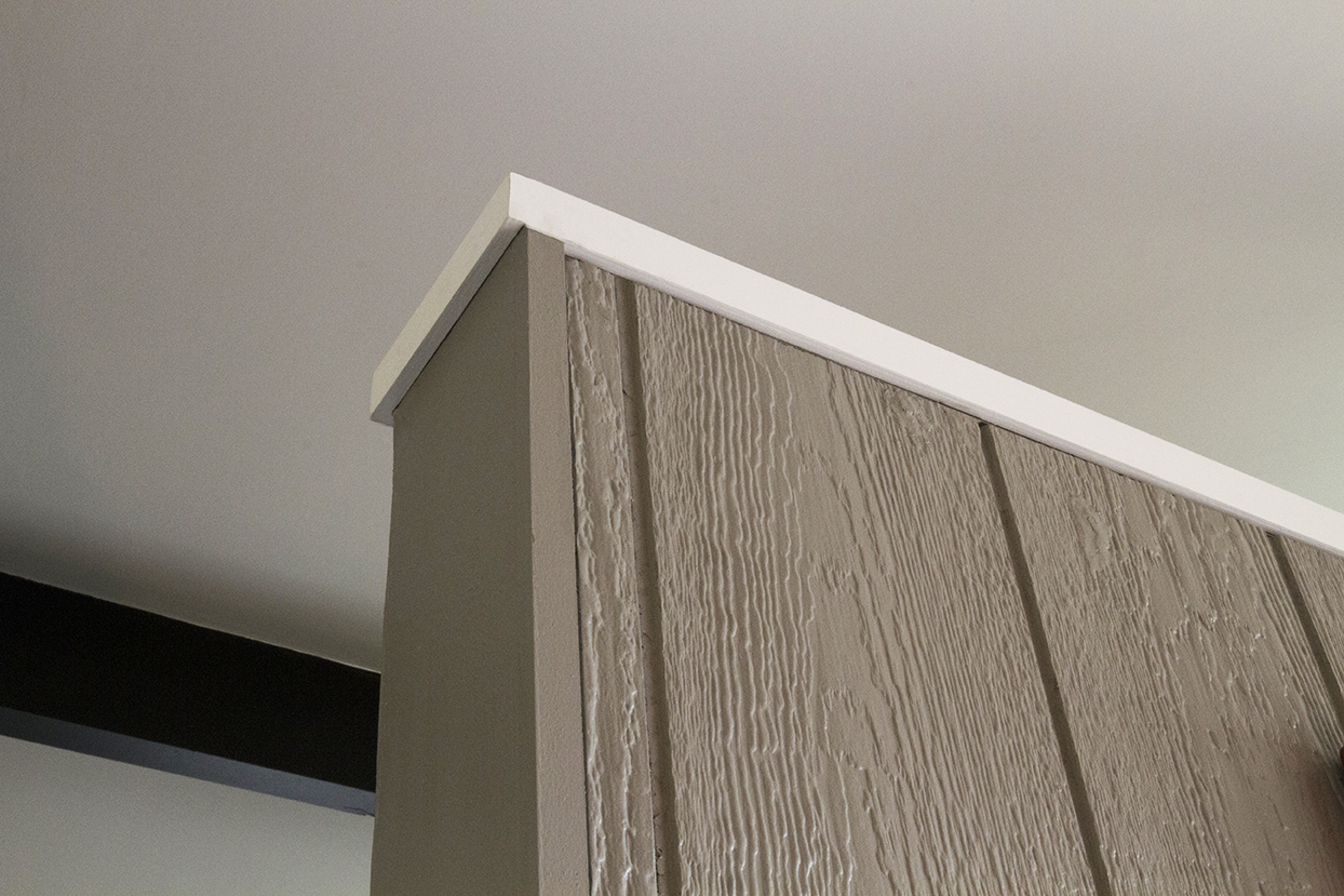
The plywood was painted to match the exterior color, Sherwin-Williams Dovetail. Because there is no base moulding outside, I chose to forego a base moulding inside as well, keeping the plywood floating just above the aggregate. I capped the top of the wall with a 1.5" flat crown for a finished look, which wraps around to the birch panel wall on the opposite side. While this plywood wall treatment is not original to the house, it feels organic to the architecture and creates one continuous plane that appears to intersect right through the wall of glass. I like to think of this installation as a celebration of the mid-century lifestyle that truly incorporates the outdoors into the indoors all year round.
