Strength in Numbers - Part 1

Out with the Old
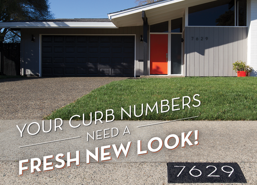
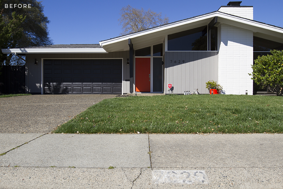
I had one thing to say to my curb street address today, "Your number is up!" Even with excellent vision, "7629" is pretty difficult to make out here. I'm not sure when the curb was last painted, but I am certain it was not in the recent past.
Having come from new construction in a community with an HOA, I am no stranger to ridiculous rules and regulations regarding house numbers, approved font choices, and all that ridiculous noise. Never. Again. So, when it came time for an address makeover, I wanted something to compliment my new stand-off numbers on the front exterior. Most number stencils use awful font choices with the standard, chunky, military look and no modern appeal whatsoever. There are some beautiful modern vinyl templates on the market, but most are made for smooth surfaces. My curb is rough aggregate, which requires some extra effort, so I opted to take pride in designing my own stencil.
A Fresh Start
I took measurements of the curb and typeset the numbers in Illustrator using the classic Neutra font. I printed the file on cardstock and cut out the shapes with a craft knife on a cutting mat. Prepping the concrete surface was pretty simple. After giving the curb a quick sweep, I taped off a 16.5" x 7" rectangle and masked the surrounding area with sheets of newsprint to protect from overspray. The rectangle was then painted with 2 coats of matte black spraypaint. After the paint had dried, I placed my stencil over the newly painted rectangle and taped the edges. Masking tape was also applied to the back side of the inner circles of the 6 and 9. Look! No unsightly vertical stencil lines!
To get a thicker, slightly raised look for the numbers, I used a flat artist brush and exterior latex paint. I chose Sherwin-Williams Snowbound, which is the same color as the exterior trim and eaves. 3 coats were needed to give the numbers a bold, contrasting look. Once the white paint dried, I removed the stencil. My curb is a rough texture, so the number edges had quite a few bleed areas that needed touch-ups. I used a fine detail brush dipped into a small cup of flat black spraypaint. This part took a steady hand and some patience to get a super crisp look, but well worth the effort. I then sprayed the entire surface with 2 coats of clear matte for added weather protection.
Sharing the Love
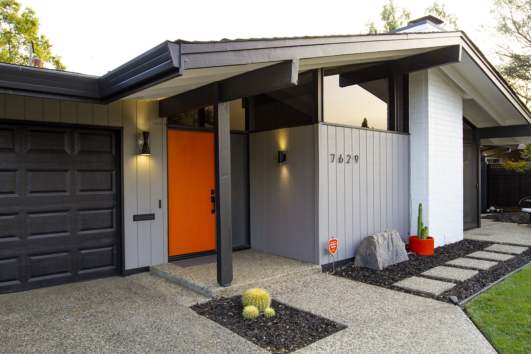
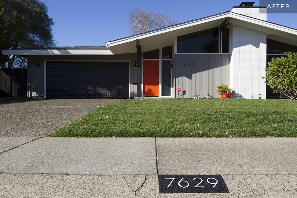
This little change adds a big impact resulting in a high-contrast, sleek, modern look that compliments the house and calls attention to some of its best assets. If my orange door wasn't enough of a marker, I think the pizza delivery driver will have no trouble finding 7629 next time he shows up. Even my lovely neighbors took note of the newly embellished curb, and asked if I would give their numbers a matching facelift -- proof that one person who cares can make a difference!
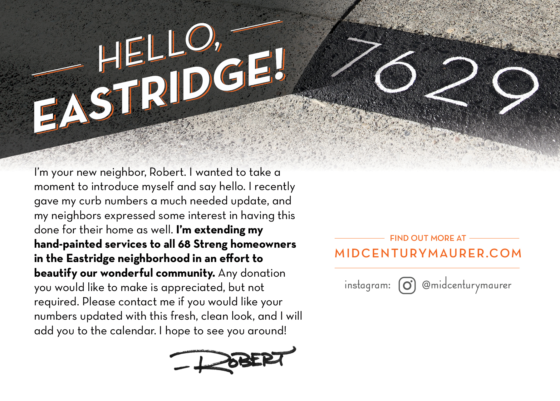
I'll soon be distributing a postcard to all 68 Streng homeowners in the neighborhood, extending my services to hand-paint their curb numbers as well. While small donations for supplies are appreciated, I am offering my services free of charge in an effort to beautify our wonderful community. I hope to be back here with a post showing off the participation of the entire neighborhood soon. Continue reading in Part 2 of this series!
