Stylish Sanctuary

A big part of my forward momentum with renovating my home has come from my passion for entertaining. Having a comfortable space for guests to crash after an intense night of boardgames and cocktails is always appreciated, and I am always happy to accommodate visitors.
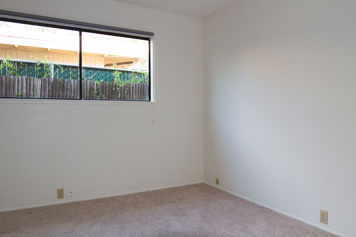
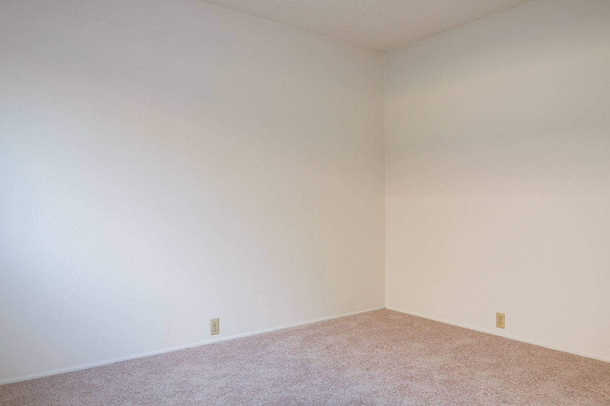
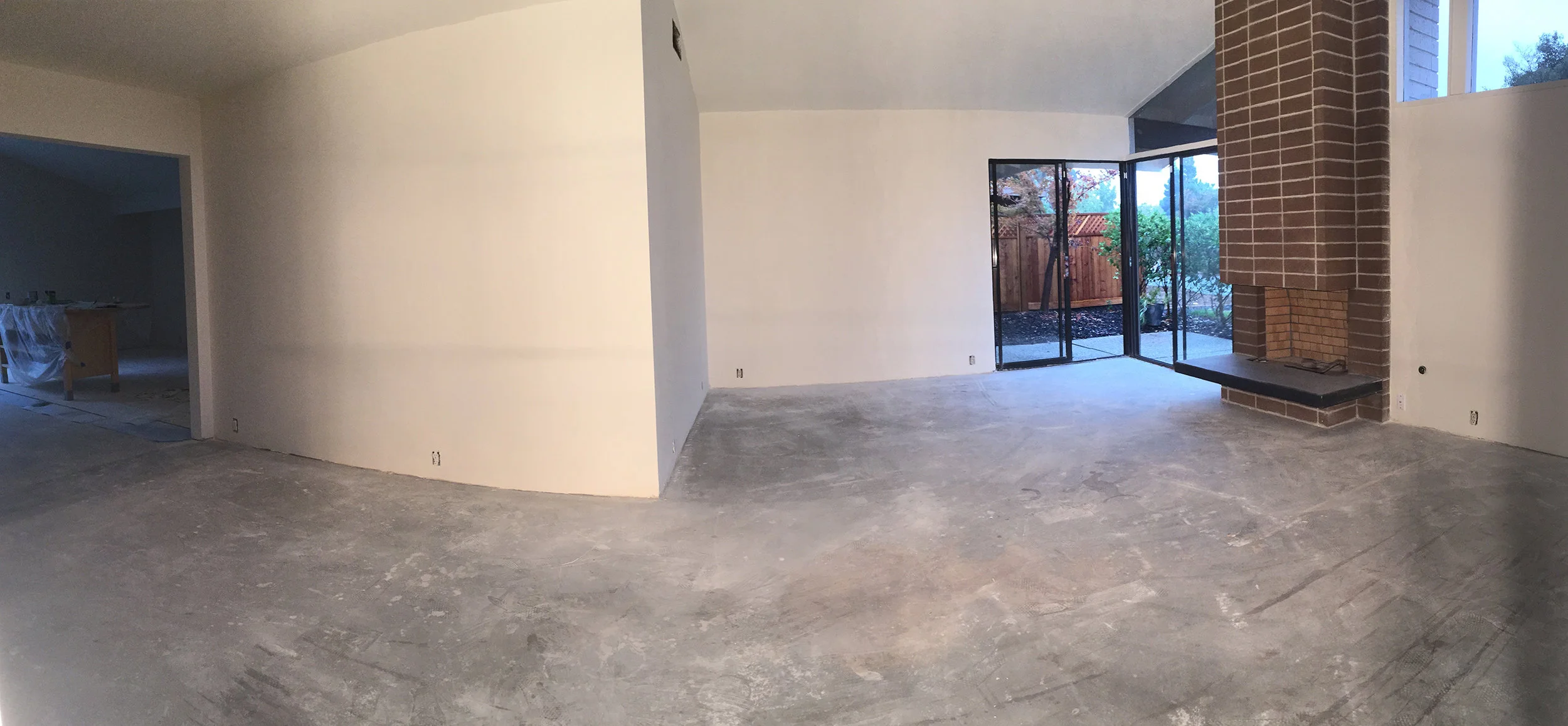
The guest room was pretty much an empty shell upon moving in — white textured walls, gray carpet, venetian mini-blinds— there was plenty of room for inspiration!
Let there be Light
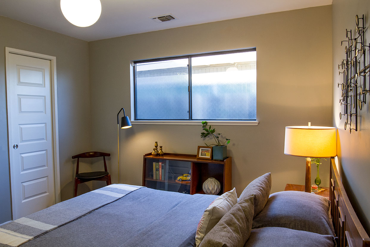
With just one window on the east side of the house, this room felt dark and shadowy, particularly in the afternoon. Streng Bros. homes, like many mid-mods, relied on natural light to illuminate the spaces instead of incandescent ceiling fixtures. But with limited sun exposure, I felt this space would feel more warm and inviting with an iconic globe pendant. Having this fixture in the center of the room makes the space feel less cave-like both day and night. The brass hardware, fabric-wrapped cord and milk glass bring a touch of sophistication, timeless style, and yes, ...light!
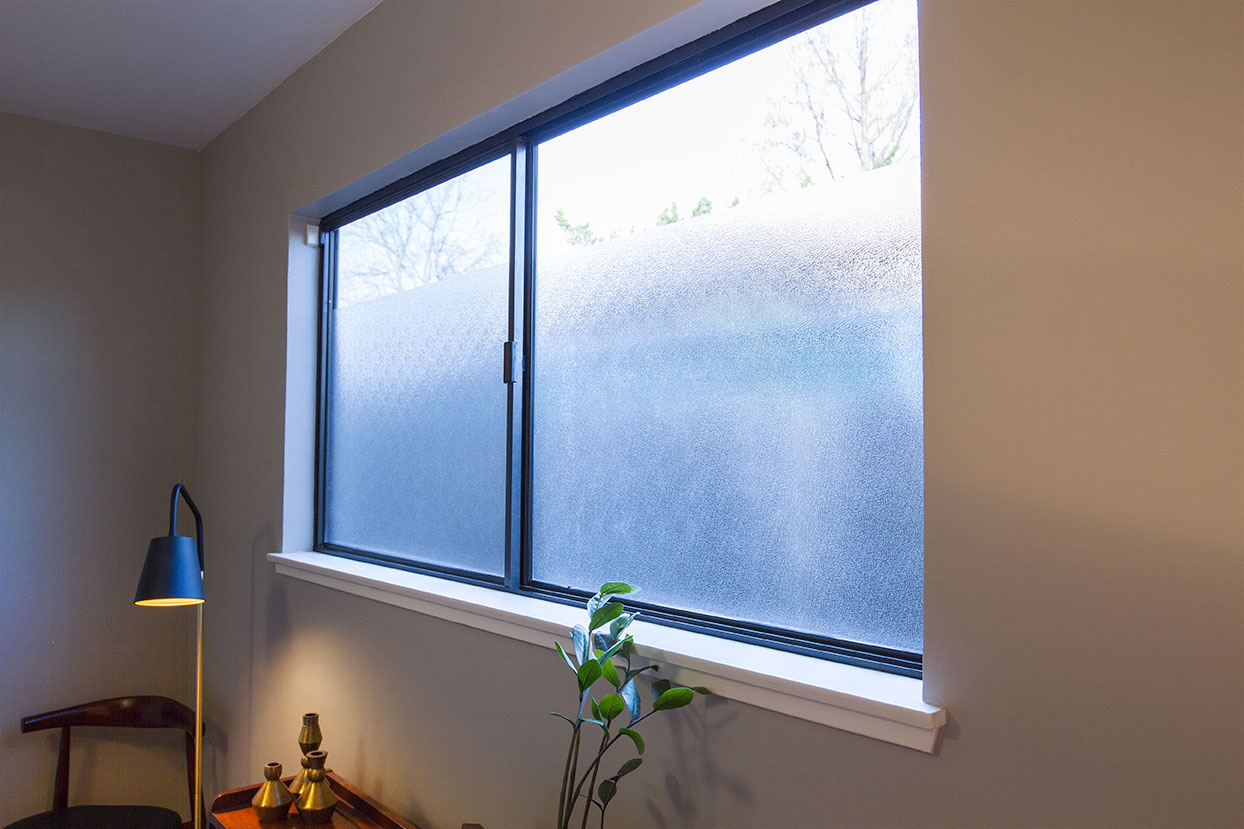
The view from this room is not especially appealing, but I am a firm believer that curtains generally should not be used in mid-century modern decor in order to keep the aesthetic feeling minimal and architectural. However, with the mini-blinds removed, I was staring at a weathered grape stake fence, the backside of a chain-link fence, unruly vines, and a neighboring roof gutter — this was not going to make my guests feel relaxed whatsoever.
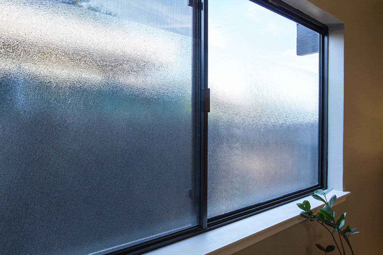
I was recently introduced to a window privacy film that ended up being the perfect solution. The textured effect mimics the pyramid glass featured at the front entry, adding interest to the windows without obstructing any incoming light. Various sized rolls of film are available, but I opted for the 24"x36", which leaves an 8-inch gap of clear glass at the top of the window. Guests can see the sky and trees, but no obstructions, and no one can see in. Added bonus: one less set of windows to clean!
Bringing it all Together
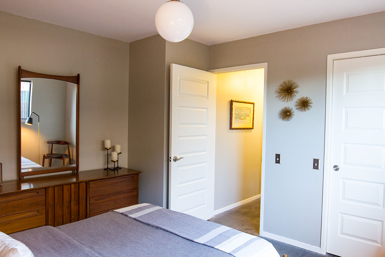
Having the walls and ceilings smoothed and concrete floors finished were key to making this space feel open and inviting. For continuity with adjacent spaces, I painted the room with Sherwin-Williams Mindful Gray, and laid new baseboards, which I painted Snowbound.
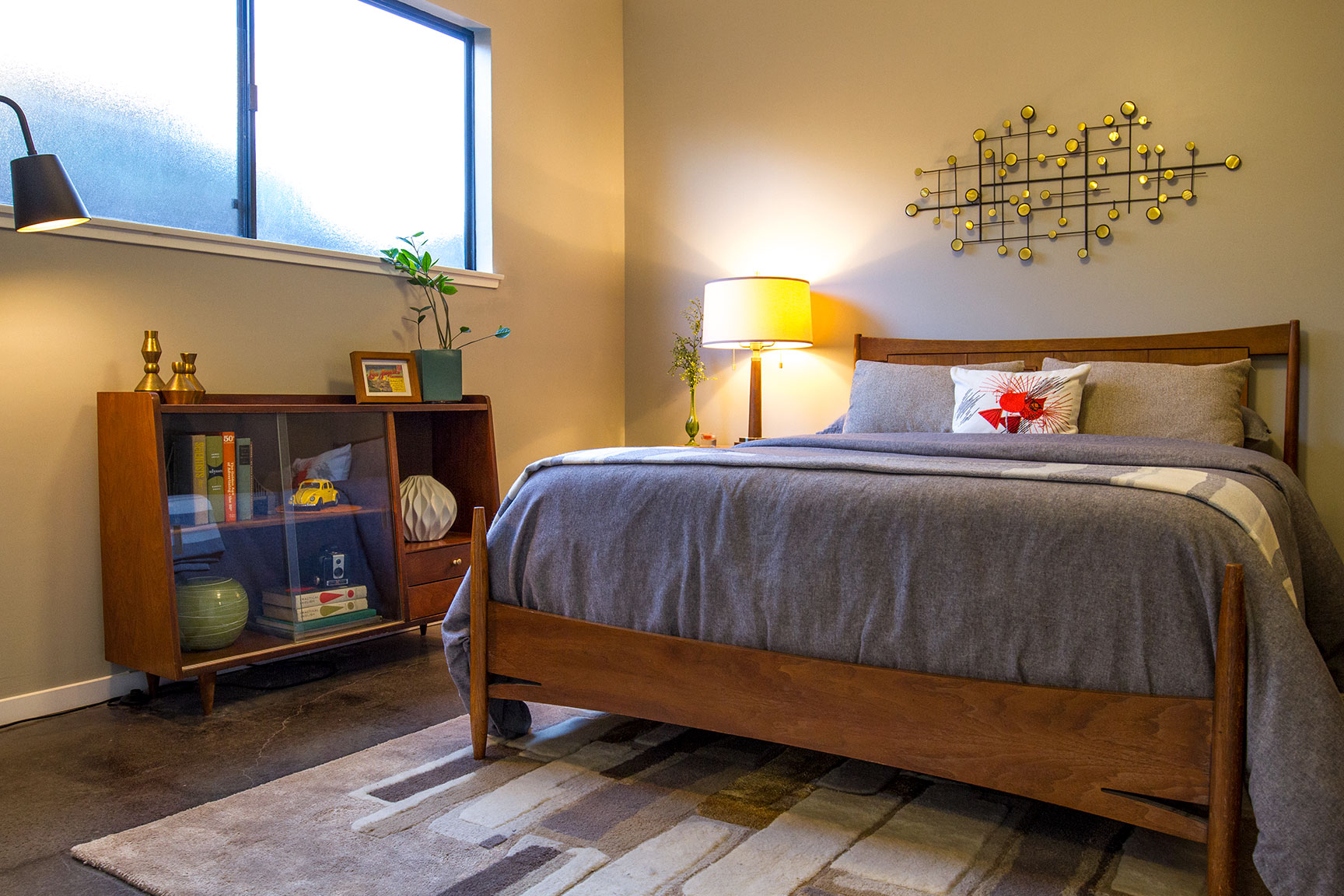
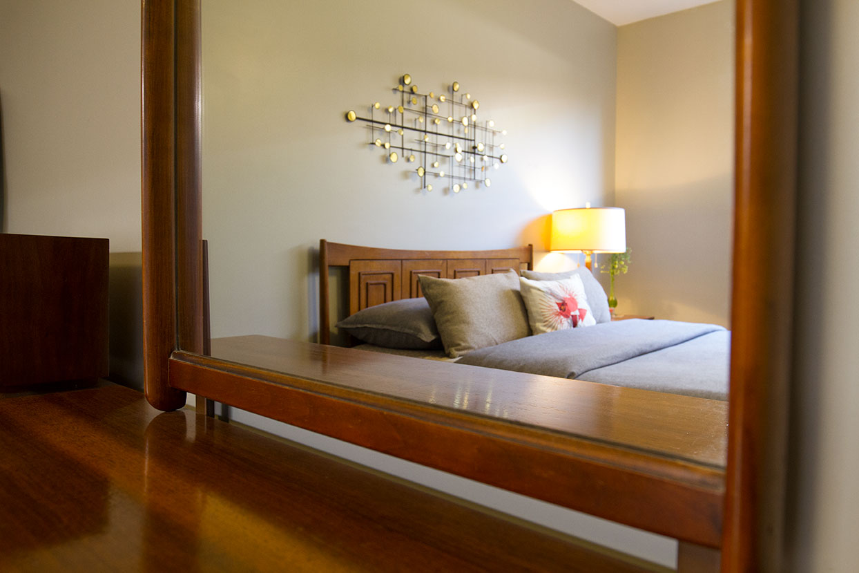
I've been collecting vintage furniture for many years now, and was thrilled to have a beautiful, minimal space to properly showcase some of these pieces. The American of Martinsville dresser and nightstand bring a rich warmth to the space, while the gentle curves of the Broyhill Sculptra bed compliment the drawer pulls and mirror frame.
I refurbished the top of an early '60s hutch to use as a bookcase under the window. This is the perfect sized piece for books and decorative items, and the sliding glass doors keep the dust away.
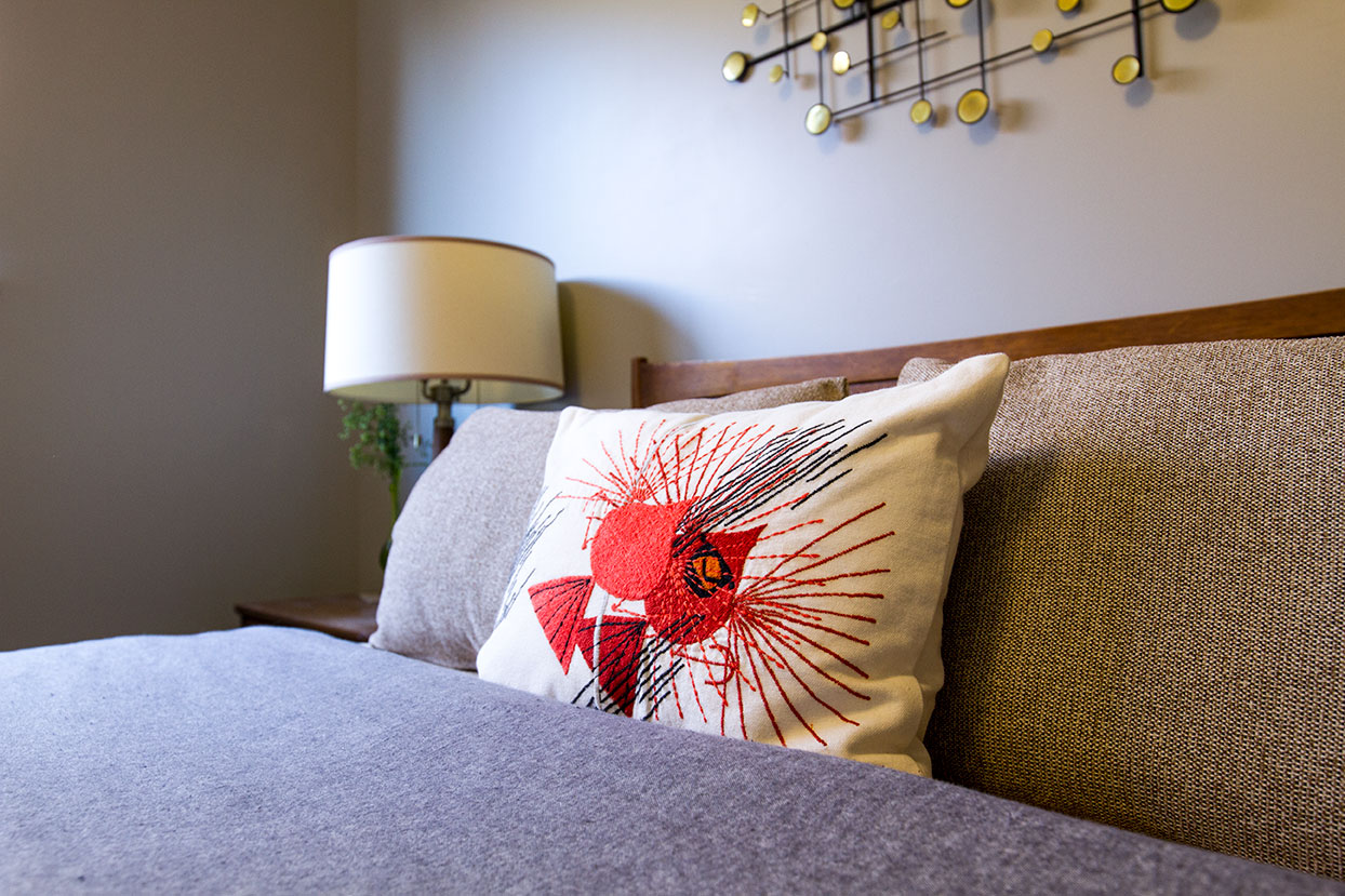
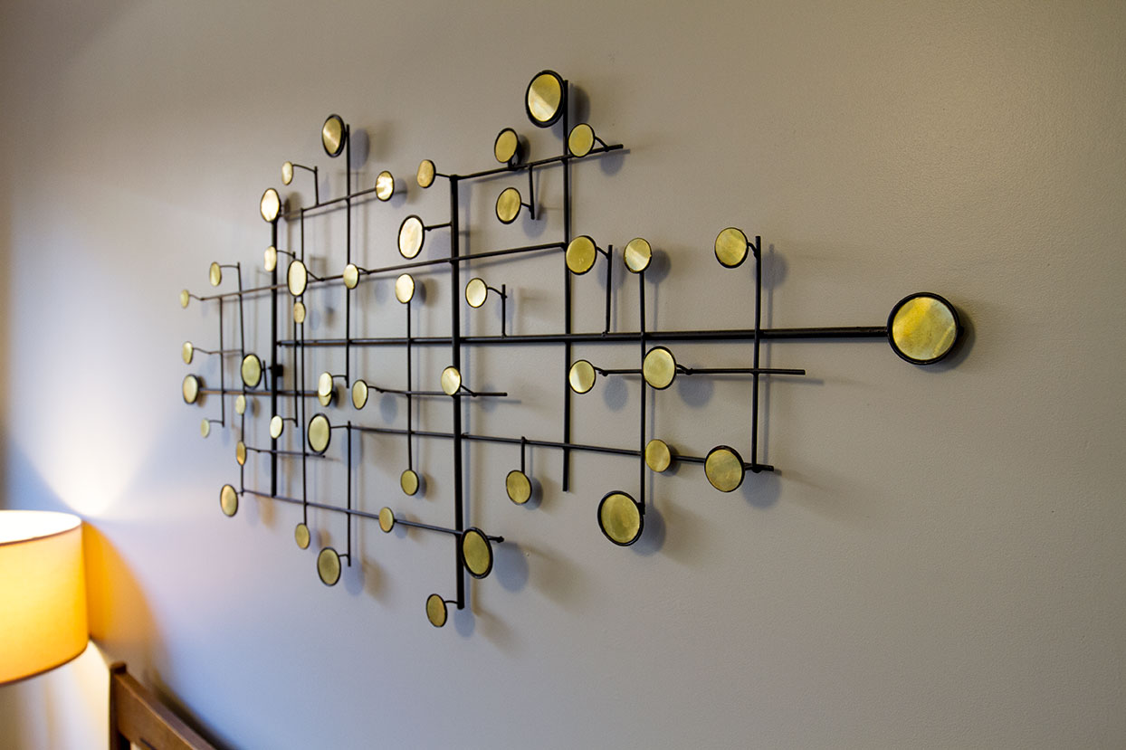
The art over the bed has a strong Eames Dot influence, but it wasn't always that way. I picked up the piece from WalMart on the cheap quite a few years back, but only for its frame shape. Inside every circle was a multifaceted clear jewel, which I promptly pried off and replaced with custom cut circles from a thin sheet of brass. Getting rid of the glam-luxe look makes this piece appear more vintage and authentic to the era of the surrounding pieces.
The room consists mainly of variegated neutral tones of gray, brown and ivory, including the bed linens and wool rug. A welcomed, vibrant pop of color was added with a limited edition Charley Harper cardinal pillow from West Elm.
A little bit of thoughtful planning combined with collecting, and some simple design principles went a long way in transforming this functional southeast corner of the house. The space is a blend of both vintage and modern, providing guests with a private, cozy retreat to call home whether for a night, a weekend, or perhaps a longer stay.
